Tuesday, July 30, 2019

Teleidoscopic salad


I've used a teleidoscope to generate a wide range of subtle geometric patterns... which was a great way to learn that my friends don't really like subtle geometric patterns.  (Haha!)  For my friends who like conventional postcard topics (sunsets, tropical flowers, famous landmarks), these images are a bit busy AND too abstract for them.  So I'll just post them here.

Teleidoscope 3


From the imaginary series, Images Made in My Living Room while Working From Home with Bronchitis.

Teleidoscope 2


The lace leaves show well in this image, with the sun shining through both layers of curtains...

Teleidoscope 1


This was produced opticially, rather than by software; it is a teleidoscopic image of light shining through a curtain, with the ball lens placed up against the weave of the fabric.

Kaleidoscopes are popular with children and artists, and contain colorful objects that create patterns inside the device; teleidoscopes are outward looking, and mirror a snippet of the real world within three mirrors.  The teleidoscope was patented in the 1970s, and isn't as common as much older and more established kaleidoscopes, but interest me from a pattern-making point of view.  Also, working with a ball lens is novel...


Friday, July 26, 2019

Studying the screw


Machined things need special machines to manage, of course.  (This machine is at the SF Museum of Craft and Design (sfmcd.org), though I'm not going to say much about the show, which isn't what I'd expected.)

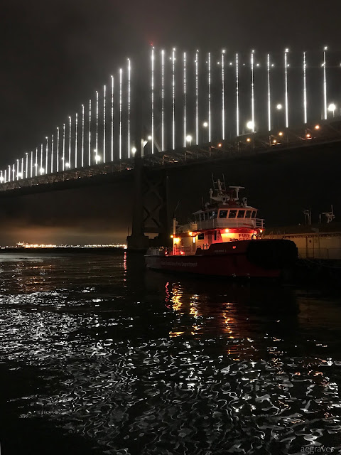
Such a beautiful night


Just beyond the fog line, it was a stunningly beautiful evening...

I have an album of images from my walk here: 2019.07.26 Evening, Mission Bay to Embarcadero (photos.google.com).

Sunday, July 21, 2019

Adorable house of the afternoon


The colors!  The details!  The highly selective application of gold!  This is so charming.  It is just off 24th Street in the Inner Mission, and little hearts came out of my eyes while staring at it.

Yes, it is narrow.  Our lots in SF are long and narrow.  But the houses make great use of the space inside!

The Mission is a visually rich neighborhood...  No wonder I wanted to take up photography.  How could I resist all of this?

Vivid neighbor


This is quite the storefront! (On 24th Street, in the Inner Mission.)

Grand Entrance


This is the fabulous entrance to Precita Eyes (precitaeyes.org).

(Sunny) Balmy Alley


I feel lucky to have grown up in the Mission District, where the cultural influences of Mexican Muralism (wikipedia.org) manifest in fantastic ways!

If you want to go on a mural tour or learn more about murals, Precita Eyes is the local center for fantastic knowledge about existing murals, and active community projects to create new ones.


Precita Eyes: New Projects

New Projects

Happiness is a refreshed mural


I'm always happy to see a bright, well-maintained mural!  This is La Rumba no para (honoring Chata Gutierrez) - A Walls of Respect Mural by Carlos Gonzalez.

Also: it looks so fantastic in the SUNSHINE!!  I was happy to get out of the fog and visit the Mission, where the sun shines more often.

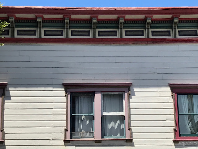
Old buildings with colorful edges


Sure, I trained in architecture after modernism, but I don't generally think 'ornament is a crime' (though I'd like to press charges over the entire Baroque era).

And I really like the old buildings in the Mission district, with their visible seams, signs of age-related settling (a condition I surely am also suffering from), and both their bold and faded colors.

Sunday, July 7, 2019

Hooray for a Great Women's World Cup Football (Soccer!) Final!

I was out in my women's kit, and two people chatted me up about how great today's game was. And both were young men! Hooray for young San Francisco men being cool about the women's game! (I love this town!)

Ants in schools


She is WINKING at us!

Mission Letters

Stamps for good people


This mural, relating to people who are working to help refugees, is part of a bigger project.  You can read more about it at www.resolve.site.

Resolve

There are people doing profound good in the world. Their stories don't get told much. We tell them through unique gatherings and art.


Friday, July 5, 2019

Book: Invisible Women: Data Bias in a World Designed for Men, by Caroline Criado Perez


I purchased this book, Invisible Women: Data Bias in a World Designed for Men, by Caroline Criado Perez at my local independent bookseller in April, and am finally getting to read it now.

IT IS EXCELLENT.  And the cover design, shown above in this collage, is BRILLIANT.

This book hit the shelves near the time of the NASA spacesuit debacle, which was PERFECT timing.  (If you missed it, try the Engadget piece, An ill-fitting spacesuit cancels NASA's first all-female spacewalk.)  Women exist: what a surprise!

I've long known that women are excluded from decisions and plans relating to our environment.  After all, I trained as an architect, and was told to always design everything to suit a six foot tall, able-bodied man.  I was told this is so my designs would suit "everyone," but this couldn't explain why I spent so much of my time pulling items off high shelves for other women throughout my life.  (My size privilege as a tall woman is still one that I use for others with great awareness, by OFFERING my assistance normal-sized, pensive women staring upwards at out-of-reach-for-them-items.  I am beloved by many a grandmother to this day.)  It didn't explain why some of my colleagues had to suffer through sitting in chairs which didn't allow their feet to touch the ground, or why my wheelchair-using colleagues were not being well accommodated.  It didn't explain why my female relatives had to wait so long to have common medical conditions diagnosed, or why popular medications fail to work for me or others in my family. But there is a pattern to it all, and data shows the pattern.

This engagingly written book covers a lot of topics and features abundant data (with abundant, end-noted citations), showing how excluding women creates harmful, life-or-death issues. She cites studies which show that women who have heart surgery don't heal as well, because they are still expected to provide caregiving to others, while men heal well because they RECEIVE caregiving.  (Single women without families heal measurably better!)  Doctors look for typical male symptoms for heart attacks, rather than those of women, which doesn't lead to good medical outcomes...   Certain lifesaving, pacemaker-type devices aren't given to women, because they are recommended and configured for male heart rates... Women die in car wrecks at a significantly higher rate and suffer worse injuries in car accidents generally because car safety features are built for and tested on people (and models of people) larger and differently weighted than they are.  And study results can differ dramatically in male and female mice - and the goal should be to test both and sex-sort the results, rather than only use male mice, but this is... controversial to male panels who approve what studies get funded.  *heavy sigh*

She covers social phenomenon also: yes, it is documented that living with your husband ADDS SEVEN HOURS OF HOUSEWORK to YOUR week, if you are a woman, over what you'd do if single!  (I know this from real life, but it's nice to see it in structured studies.)

This is a fantastic, timely book.  

Gray-greens I adore at the Asian Art Museum


The interiors of San Francisco's Asian Art Museum (asianart.org) as adapted by the brilliant architect Gae Aulenti, are delightful and soothing, and evoke a very different mood from when the building served as the City's Main Library (which is now in a newer building across the street).  It's a brilliant adaptation, and while surrounded by ancient works from across the Pacific, feels a world apart from the City that surrounds it, while engaging with it in interesting ways (in the entrance; in the cafe and on its patio; and especially in the escalator corridor, where the balcony at the top protrudes beyond the building and over the harsh urban streets).

One of the interior elements that especially impresses me is the staging: the choices made for the backdrops of the art.  Different regions have different colors, but those colors!!  They are colors that make me want to mix new greens from all of my various watercolors (but especially the antique Japanese set).  They don't distract, but I really do love them.