A.E. Graves' old-school blog. iPhone13 photos; previously: iPhone 7 or 5 photos, topical posts, migrated Google+ posts (2011 to 2019); iPhone 1 photos (Jan 2008 - Sept 2012). My photos copyright A.E.Graves; reviewed/other content copyright remains with their respective creators!
Thursday, December 31, 2020
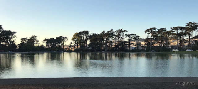
Mirrors and foam
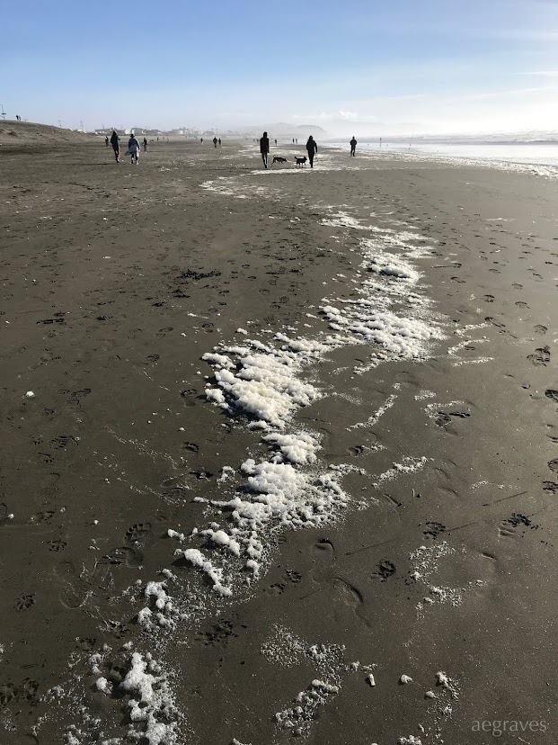
Foam line
Streaked sky
High sun
Fiery ice plant
Less famous windmill
Fuzz-edged
Wednesday, December 30, 2020
Serious postage variety
Monday, December 28, 2020
Sunday afternoon, looking east from Lake Merced
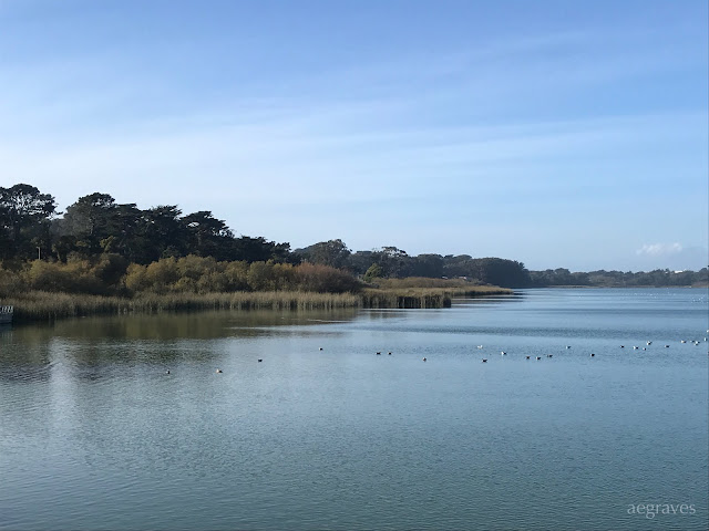
Soft, muted shore
Sunday gold
Friday, December 25, 2020
Recent Netherlands stamps from a friend
Friday, December 18, 2020
Sunday, December 13, 2020
Friday, November 27, 2020
Warm glow
Sinking sun
Strolling along the shore
At the beach
Light through the eucalyptus trees
Lakeshore
Wednesday, November 25, 2020
Wednesday watercolors (watercolor crayons)
Sunday, November 15, 2020
Presidio in November Sunshine
Saturday, October 31, 2020
Orange Halloween Sky
Exiting the Gate
Sunset screen
Drawn-on Star
(Spot the) Hummingbird
Festival atmosphere (and crowds)
Duck watch
Sunday, October 25, 2020
Two submerged trees in the greenest pond
Happy fish
Sunday, October 18, 2020
Friday, October 16, 2020
340-plus pages of voting materials
Sunday, October 11, 2020
My notebooks can be self-critical
Saturday, October 10, 2020
Sunday, October 4, 2020
Postcard preview - lessons in progress
 |
It's that time again, when I need to refresh my collection of postcards for my postcard exchange club. As a photographer, I'm honor bound to make my own: while I've found some lovely pre-made cards in bookshops that suit my tastes, people in the club complain about duplicates, and having my own images printed prevents that. (Also: bookshops are still largely closed here due to COVID-19 restrictions, and while I can order books for pickup, small gift items are not on the menu.)
It's been difficult for me to think about postcards properly: the ones in the shops always seemed so cliché, and I've generally avoided photographing anything famous - I barely can SEE the famous things, due to overexposure to them as symbols of my hometown. I usually focus on little details that delight me personally, which works for botany, but not so much for easily recognized symbols of a place that someone who has only seen my hometown in movies would want.
(I also fail to photograph with wide margins around my subjects, which WOULD help with the trimming/printing process, if I realize that my work will be subject to cropping when I print full-bleed (up to/over the edges). That's a habit that will take a while to sink in... but it frustrates me often - I use the entire frame! - so there are many images I can't use because the subject's edges will be missing in a non-artsy way. See the cream-and-burgundy streetcar card in the grid above for one that is AT RISK.)
It took repeatedly reading people's wish-lists in the postcard club to understand that there really is an interest in TYPICAL landmarks, TYPICAL famous views, and TYPICAL types of trains and buildings. They mean it! I believe them now!
I wrote about how I've been learning about the demand for "tourist cards" on my photography websites blog (yes, I have more sites) two orders ago, and am still learning (and struggling with it a bit). I now TAKE NOTES when I struggle to fulfil a stated preference, so I can dig into my archive to do better in the future.
Observations:
- I run out of streetcar cards QUICKLY.
- There is a higher demand for sunset/seashore photos than I anticipated, but I forget that those of us on the coast are living a dream of landlocked folks.
- National Parks requests seem to be rising, and I've started making my own to provide variety from the Ansel Adams landscape cards from Museum Graphics that delight me (not everyone appreciates black and white photography, however), or the Ranger Doug Enterprises WPA postcards (which are both retro and hip - Everyone loves Yellowstone and Zion's images, especially).
- Single views are preferred over multi-views
- Since I personally prefer full-bleed images (images that run over the edges, rather than those inset into a smaller frame), I should not be shy about adding colorful boxes to the cards to allow the text to stand out more clearly. The sky works well as a background, but a busy sky makes for slightly harder reading. (You should see how many font and color changes I test while laying these out!)
- Color is preferred over black and white, though black and white has zealous fans
- Keep it local: collectors sternly want photos from where the sender is, not where we went on vacation or for work
- There will always be requested topics that I don't specialize in or don't have copyright of (frogs! VanGogh paintings! puppies! outer space!), which gives me excuses to buy postcard books/sets often, especially while visiting museums. One frustration: it's hard to get postcards of work by women: they are not published or available enough. I am thrilled to have postcard books by Emily Carr (a famous painter from up near Vancouver) and Georgia O'Keefe (famous for the southwest and NY), but should be able to have more options! Also: the postcard books I can get are almost all Europeans or of that ancestry. I've got one by a remarkable Chinese brush painter, Chao Shao-An, but there really should be more!
I'm sure I'll write about this more as I work through my archive, trying to find unscanned film of the Yosemite High Country and ANY photos of redwood forests. (So many visits - where are the images now?)


